

WIM CROUWEL BOOKLET
Context
- Master’s Degree in HCI, “Visual design” course, final project
- Individual project
IN A NUTSHELL
The project is a tribute to the inspiring designer Wim Crouwel. I tried to create a booklet by respecting the style of the Dutch designer based on modernist principles, clearness, structure and the employment of a grid-based methodology.
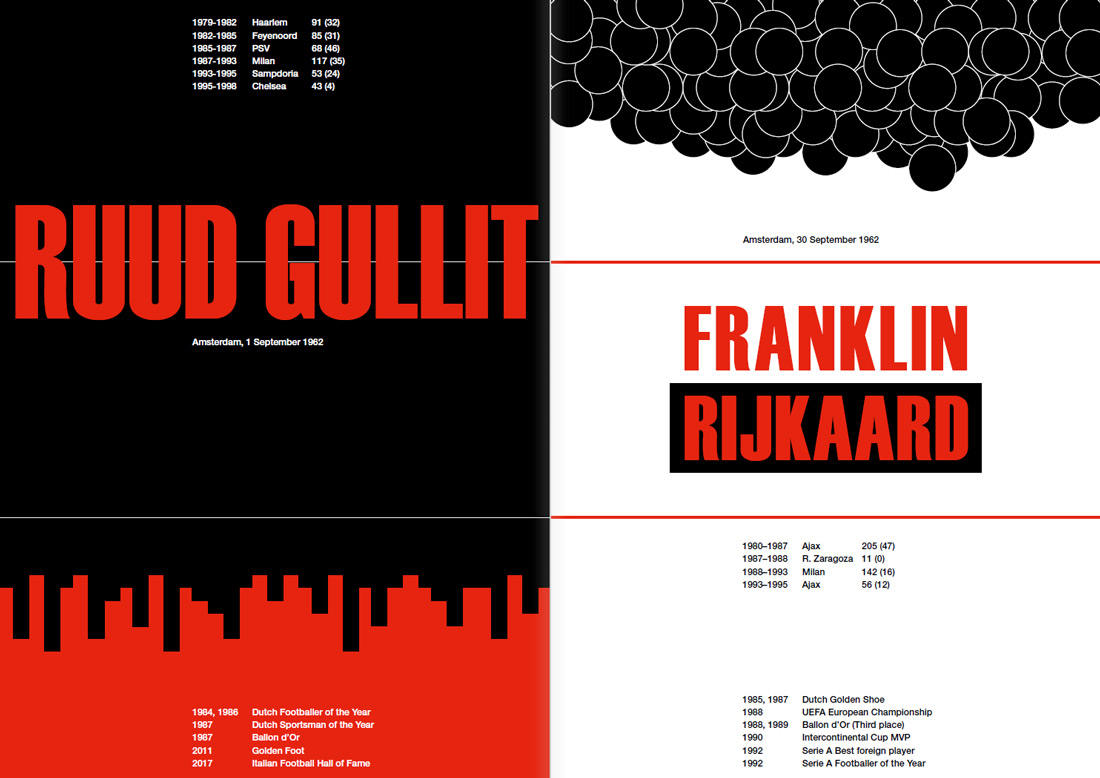
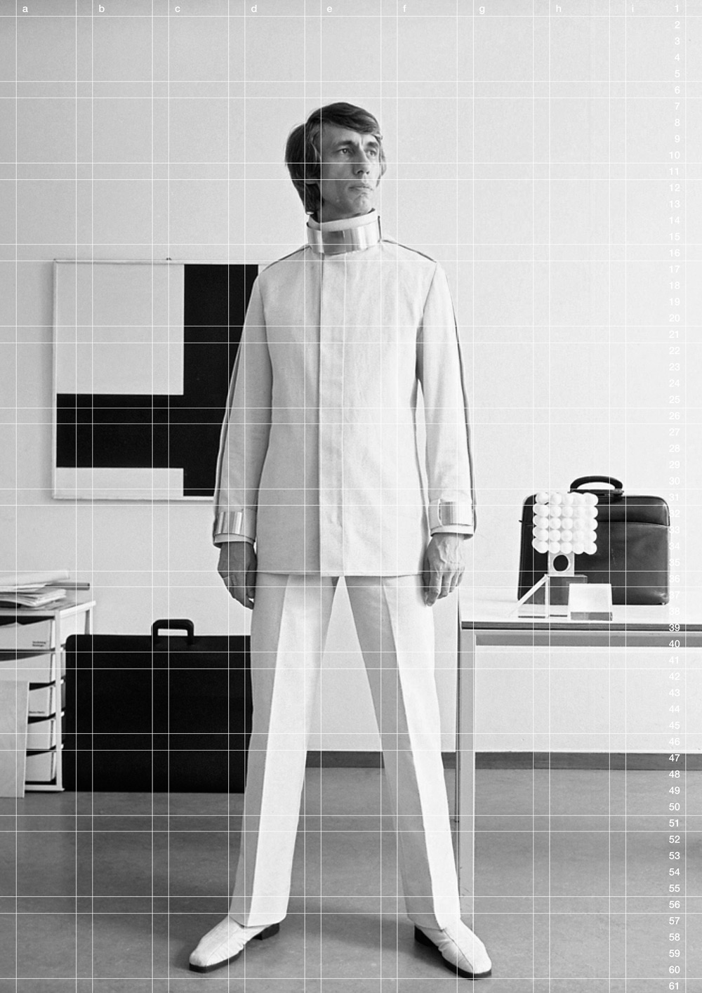
The “Dutch trio” posters, based on one grid and a set of rules, are inspired by the work that Crouwel did for the Stedelijk Museum by designing posters with a common thread.
IN DETAIL
THE PROJECT
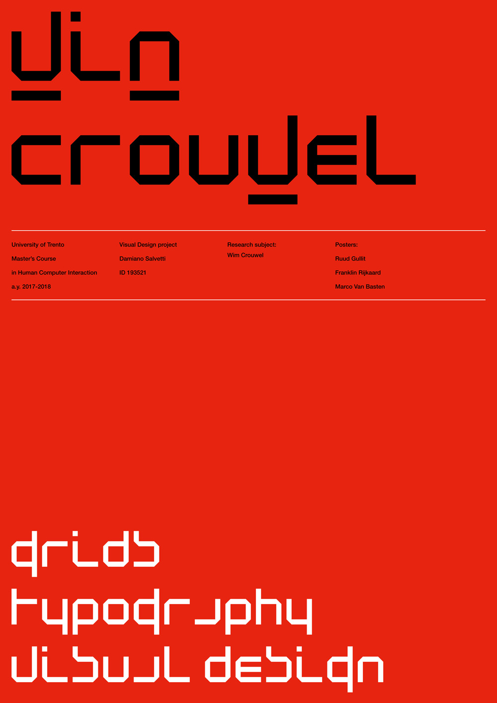
The booklet relates to the final project of the “Visual Design” course of the Masters’ degree in Human-Computer Interaction of the University of Trento. The project consisted of a research about a designer, a studio or a company to be narrated through a publication by applying the design skills acquired during the course.
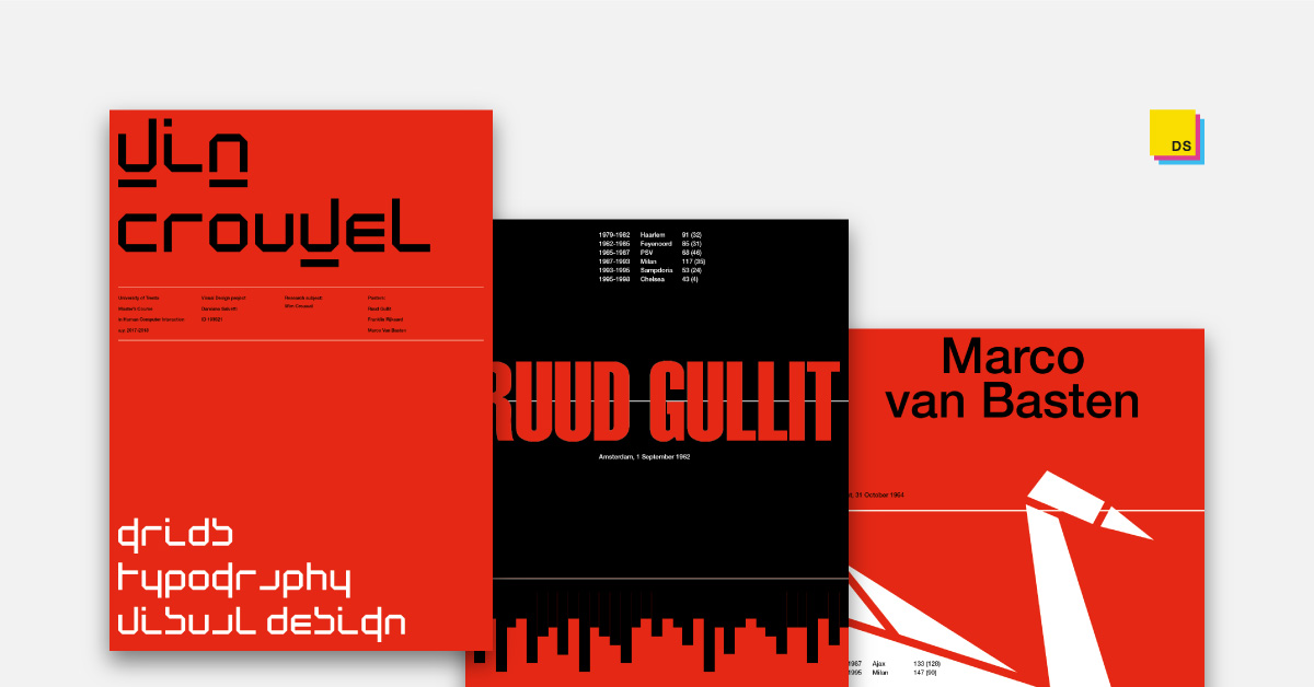
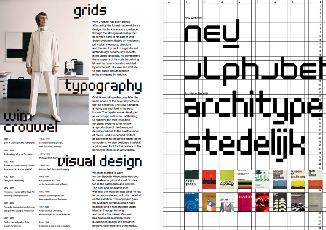
My research focused on the Dutch designer Wim Crouwel (“Mr Gridnik”) and I tried to pay tribute with a booklet with respect to his style based on modernist principles, clearness, structure and the employment of a grid-based methodology.
THE BOOKLET
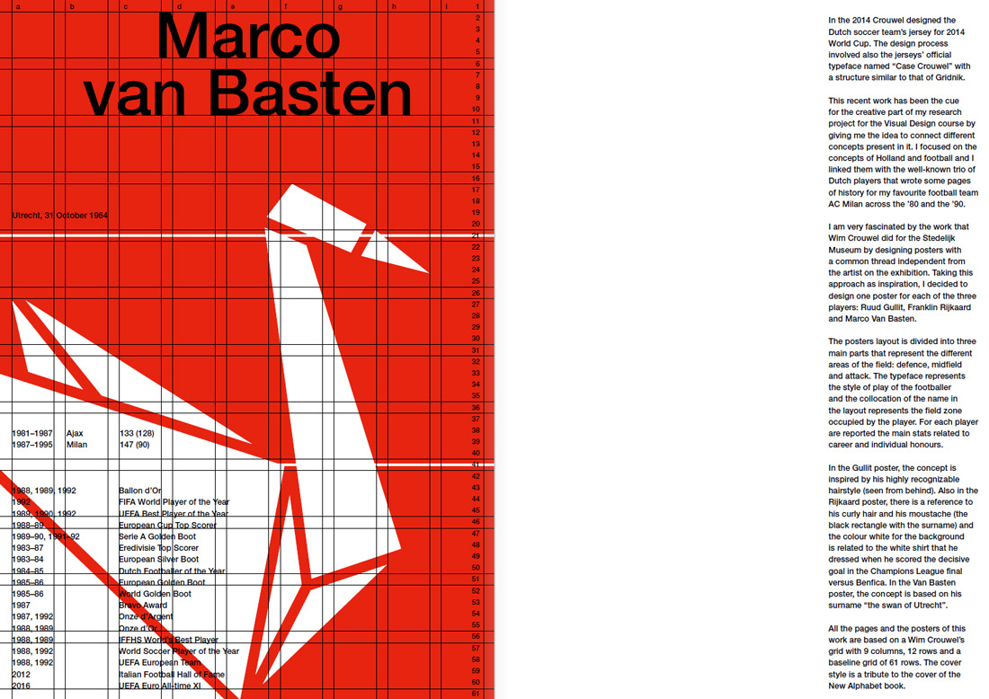
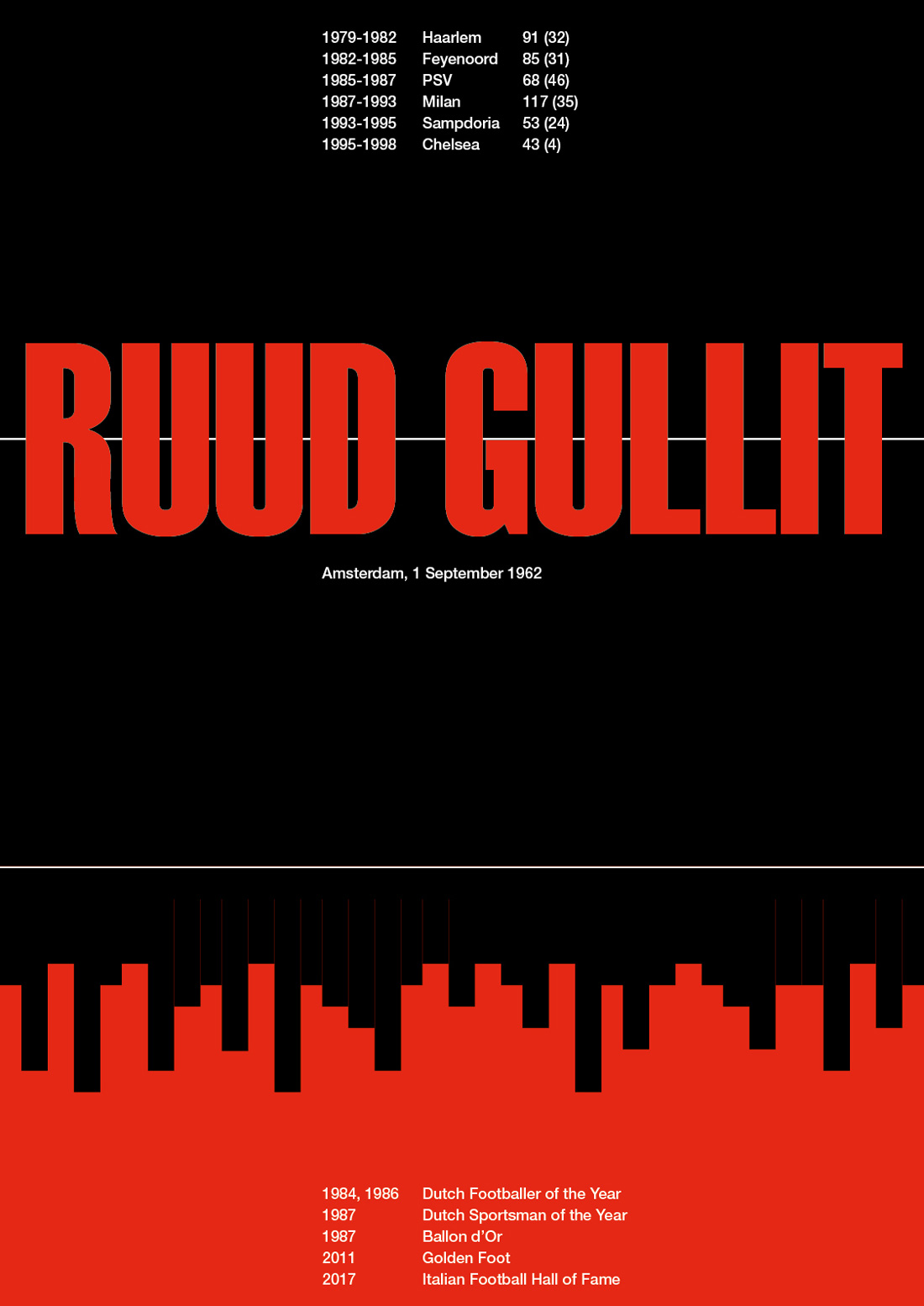
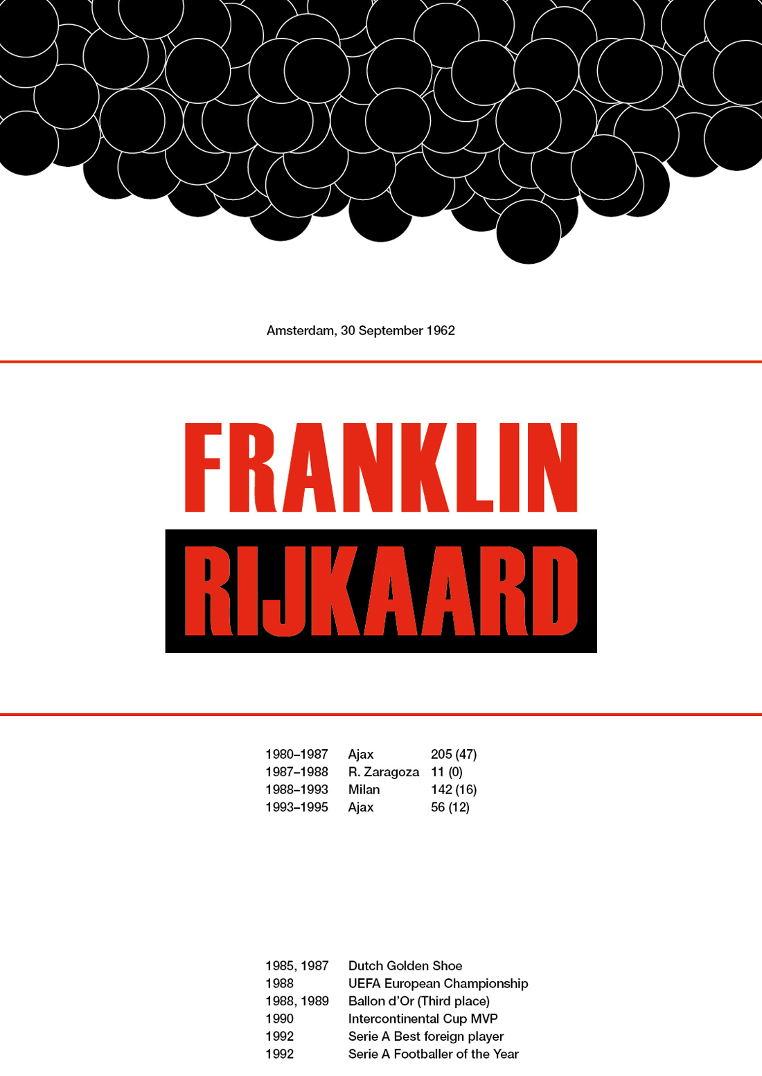
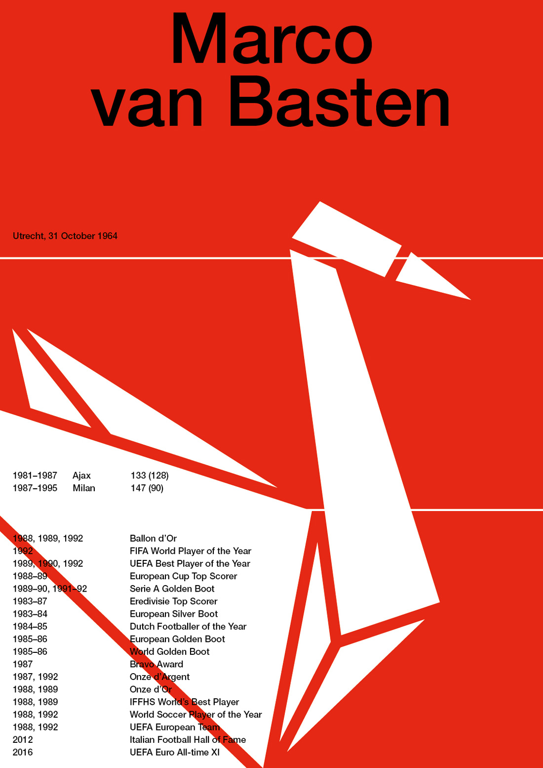
On the occasion of the World Cup 2014, Crouwel designed the Dutch football team’s jersey and the jerseys’ official typeface named “Case Crouwel”. This work has been the cue for my visual design project in which I focused on the “Dutch trio” (Gullit, Rijkaard, and Van Basten) that wrote some pages of history for my favourite football team AC Milan across the ’80 and the ’90.
I am very fascinated by the work that Crouwel did for the Stedelijk Museum by designing posters with a common thread, independent from the artist on the exhibition, by creating one grid and a set of rules for all the posters. Taking this approach as inspiration, I designed one poster for each player.
All the pages are based on a Crouwel’s grid with 9 columns, 12 rows and a baseline grid of 61 rows. The cover is a tribute to the cover of the New Alphabet book.
Concept
His iconic hairstyle (seen from behind).
Concept
His curly hair and moustache and the white shirt dressed when he scored the decisive goal in the Champions League final.
Concept
The surname “the swan of Utrecht”.