MC DONALD’S APP
Context
- Master’s Degree in HCI,
“Prototyping interactive systems” course, final project - Individual project
IN A NUTSHELL
With the aim to improve the McDonald’s™ app (v. 1.2.16), I stated the assumptions related to the app world structure and the user’s needs. I analysed in detail five issues related to the user’s needs and for each, I proposed redesigned solutions by focusing on micro-interactions.
IN DETAIL
THE PROJECT
This case study relates to the final project of the “Prototyping interactive systems” course of the Masters’ degree in Human-Computer Interaction of the University of Trento. The project aimed to improve the McDonald’s™ app (version 1.2.16) by proposing a redesign focused on micro-interactions.
The project was divided into three phases according to the assignment. Phase 1: choose an app to be improved and present your assumptions about the app: world structure and users’ needs. Phase 2: analyse the app with reference to the framework of the course (e.g. feedbacks and feedforwards, search patterns, action vs. navigation, etc.) and underline the emerged problems. Phase 3: redesign the app by focusing on the micro-interactions and by proposing different alternatives for the same issue.
ASSUMPTIONS
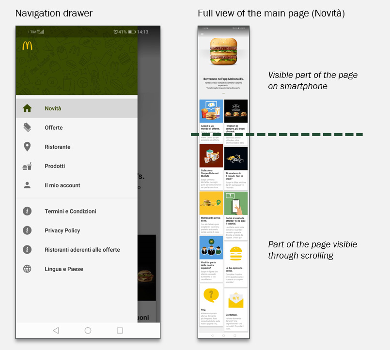
The world
The McDonald’s™ app (version 1.2.16) is organized into four sections that correspond to the structure of the main services provided:
- NEWS
All the news related to new products, new toys, and new services. - OFFERS
Special offers to be used, by registered users, in the restaurants by directly using the screen of the device thanks to dedicated QR codes. - RESTAURANTS
Searching the restaurants. - PRODUCTS
Lists all the products grouped by category.
The app requires an initial setting in which the user should select “country” and “language” as the contents and offers are tailored according to these parameters.
ANALYSIS AND DESIGN
From issues definition to proposed solutions
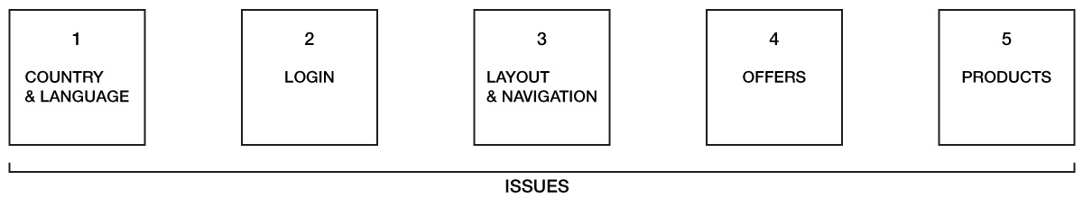
For the app redesign have been selected five design issues: #1 Country and language setting,#2 Login, #3 Layout and navigation, #4 Offers and #5 Products. The issues relate in different ways with the user’s needs identified. The redesigned versions are presented in an incrementally. So, for example, issues #4 and #5 include the redesign proposed in issue #3. Despite the incremental presentation, each redesign could be implemented independently from the others.
For each issue is presented first the current version of the app, with a description that underlines the problems identified and then the redesigned version with the explanation of the design choices. Videos and images in the box with the company logo refer to the original version of the app, while videos in the box with my logo refers to the redesigned version.
ISSUE #1 – COUNTRY AND LANGUAGE
#1. ANALYSIS
When the app is opened for the first time, it requires an initial setting in which the user should select “country” and “language” as the offers and contents are tailored according to these parameters.
PROBLEMS
- For the same action “select an item from a list” there are two completely different rules. When the action is triggered by clicking in the form field, in the case of the country the action becomes navigation by moving the interaction in a different page, while in the case of the language it opens a drop-down menu.
- The country list includes options not available with this version of the app (e.g. ‘Deutschland’) that bring the user to a page in which the alternatives are to download another app or to go back, charging excise in the interaction.
- The drop-down menu results still active also when there are no alternative options.
#1. REDESIGN
SOLUTION 1
- The setting is now on the same page.
- The action triggered by clicking in the form field has now the same rule: open a dropdown menu.
- For the country list, in which there are several items, contextual feedforwards are provided (the form icon changes accordingly to the options available).
- No available options have been removed from the list.
- When there is only one option available in the language list, the option is selected by default and the form is disabled.
SOLUTION 2
- To provide good default options.
- It is likely that, by using an app downloaded from the Italian Google Play store that provides instructions in Italian, the user is looking for the setting “Italia” and “Italiano”.
ISSUE #2 – LOGIN
#2. ANALYSIS
After the country and language setting, the user is asked if he has already or not an account.
PROBLEMS
There are no references that having an account is a requirement needed to access the offers.
#2a. USER WITH AN ACCOUNT
- the user is requested to change the password but it is not specified why.
- The back button redirects to the main page.
- The login form both in the offers page and in the account page allows to login without changing the password.
#2b. USER WITHOUT ACCOUNT
- the user is redirected to the main page of the app
- If the user tries to access the offers page it will face the login form.
#2. REDESIGN
SOLUTION
There is an explicit reference that having an account is a requirement needed to access the offers. Three different options to access are provided.
#2a. USER WITH AN ACCOUNT
- a registered user could access with his account.
#2b. USER WITHOUT AN ACCOUNT
- an unregistered user could directly create an account.
- an unregistered user could access without registration (in the offers page will face the same login page).
- the aim of this proposal is to promote access with login to allow users to start using the offers.
- it aims to provide clear information to the user and to augment the app consistency.
ISSUE #3 – LAYOUT AND NAVIGATION
#3a. LAYOUT ANALYSIS
The layout of the app is based on the main page with a header and the contents organized in cards and distributed in two columns. The header has a default and a promo version.
PROBLEMS
- The space occupied by the default version, more than half of the screen, seems to be excessive.
- The cards have the dashboard alignment style but the slight difference between them seems an error.
#3a. LAYOUT REDESIGN
SOLUTION
- The header height has been reduced.
- It is possible in this version to completely see the content of the first two cards.
- The height of the paired cards has been aligned and as a result, the layout of the main page results more ordered and less confusing.
- The aim is to improve the use of the screen space and its visual organization to make it easier for the user to use the app and to consult its contents.
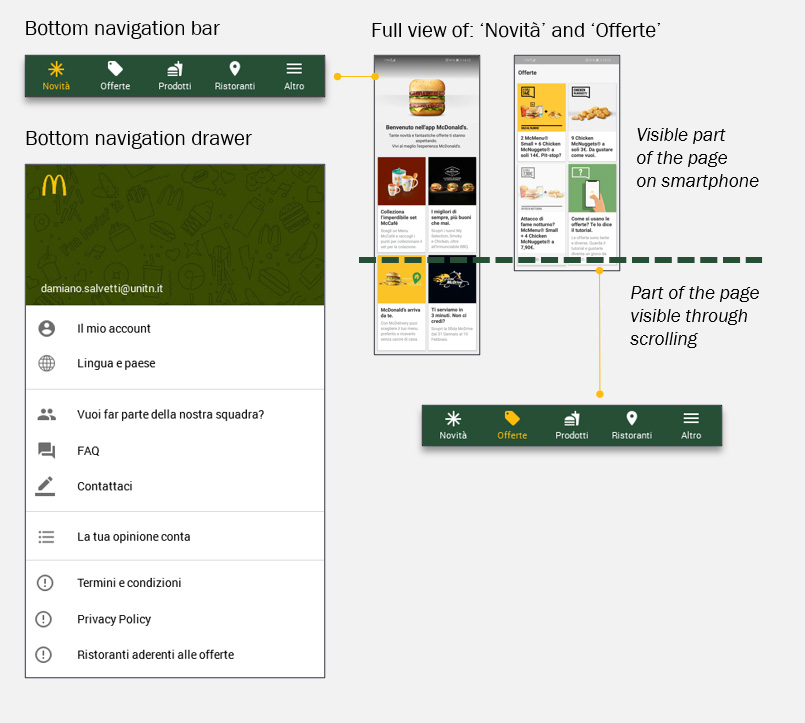
#3b. NAVIGATION ANALYSIS
There are two ways to navigate in the app: through the cards on the main page and the navigation drawer.
PROBLEMS
- When the user faces the main page for the first time, it could be difficult for him to bridge the gulf of execution.
- The structure of the system is not clear. Of the 4 main sections identified in the world analysis, only two are present on the main page,
- The user will likely click directly on the offers card. It is also likely that then the user will proceed in the use of the app without a clear idea of its structure.
- While in the navigation drawer they result as two separate sections, the main page ‘News’ includes ‘Offers’.
#3b. NAVIGATION REDESIGN
SOLUTION
- The bottom navigation bar clearly depicts the structure of the system. The new navigation system helps the user to bridge the gulf of execution.
- In addition to the ergonomic advantages, it provides the opportunity to use badge notifications.
- A specific card to access the ‘Offers’ is no longer needed and the ‘tutorial’ card previously confined in the news page is immediately visible.
- The order of the element in the bottom bar has been done according to the idea that the company would prefer to have the news section as an entry page of the app.
#3b. NAVIGATION (version 1.2.16)
#3b. REDESIGNED NAVIGATION
ISSUE #4 – OFFERS
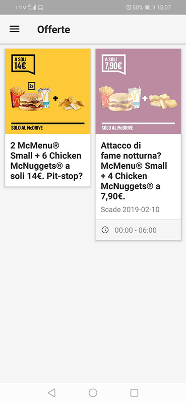
#4a. OFFER ACTIVATION ANALYSIS
PROBLEMS
- There is no feedforward related to the offer time expiration (20 minutes).
- The alert text that appears it is written on a surface usually used as a background and it uses an alarming language style.
- Once activated, in the offer page appear the QR code with the time countdown in an overlying level and a badge that partially covers the offer image.
- In the offers page, the offer card activated has now a bottom bar with an animated clock icon.
- The sum of the language used and the feedback provided create an anxious environment.
- Outside the offers section, there are no references to the activated offer.
- There is nothing in the main page or the navigation drawer that helps the user to bridge the gulf of evaluation (‘Have I an active offer?’).
#4a. OFFER ACTIVATION REDESIGN
SOLUTION
- The layout has been optimized.
- A visible informative banner with reference to the expiration time has been added.
- The confirmatory message is provided on a modal window with an adequate language and a contextual reference to time expiration.
- Once activated, it appears the QR code as a part of the card. The ‘day’ badge is now positioned on the top-right without covering the image.
- The reference to the expiration contextual time is in the informative bar with the possibility to switch it.
- In the offers page, the activated offer resume all the information needed to use it directly.
- The bottom navigation bar shows a badge notification that helps the user to bridge the gulf of evaluation (‘Have I an active offer?’).
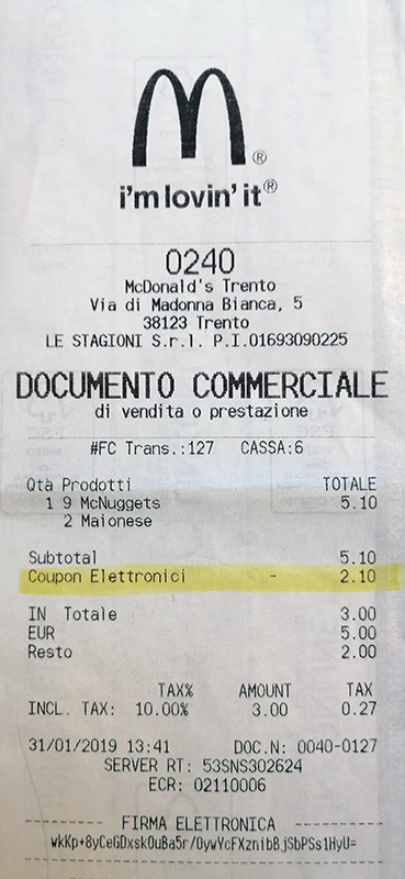
#4b. EXPIRED OFFERS ANALYSIS
PROBLEMS
- Once activated and benefited from its discount, the activated offer remains available in the offers section (until the expiration time) but without feedback related to its state.
- In the field test, the doubt was if the used offers (during the payment with the cashier) was still reusable. It was not.
- The unaltered state of the offer card can, therefore, lead the user to do a mistake.
- Once the offer is expired, the only (analogical) feedback available is present in the restaurant receipt under the voice ‘coupon’.
#4b. EXPIRED OFFERS REDESIGN
SOLUTION
- In the redesigned version feedback is provided by removing the badge of the active offer.
- Considering the central role of the offers in the use of the app a more consistent feedback system is needed.
- The proposal is to add an ‘archive offers’ page in which the expired offers are archived.
- The used offer will be automatically moved to the archive page in which the card shows a bottom banner with references to the day and time in which it has been used.
- This new page will certainly help the user in the evaluation of the state of the system in relation to the primary need of using the offers.
- Two slightly different solutions are proposed.
ISSUE #5 – PRODUCTS
#5a. PRODUCTS LAYOUT ANALYSIS
With reference to the LATCH theory (Location, Alphabet, Time, Category, and Hierarchy), the products information are organized by Category.
PROBLEMS
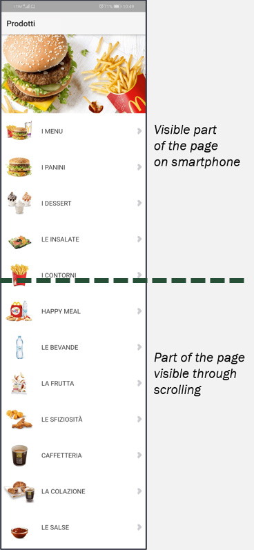
- The section has a completely different layout from the others, with a header and the products presented as a list.
- The arrows on the right suggest navigation in that direction, in contrast with the navigation in-depth proposed by the cards system.
- The images of the products are very small and despite this, to see the whole list long scrolling is needed.
- The back button of the product details page wrongly brings to the main page.
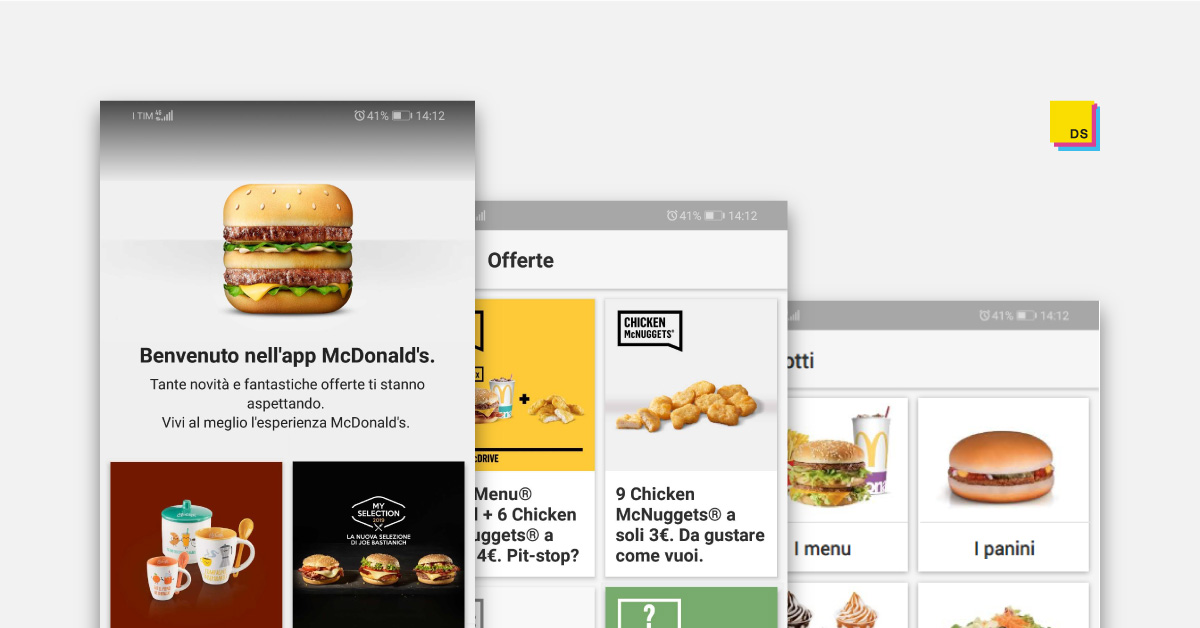
#5a. PRODUCTS LAYOUT REDESIGN
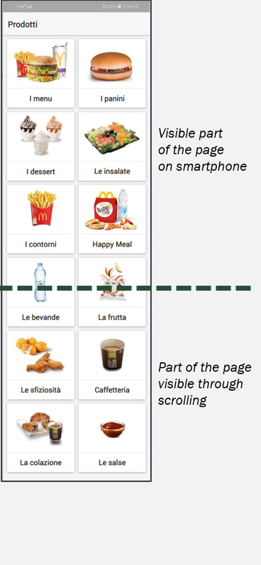
SOLUTION
- The proposed redesign introduces the cards layout system in line with the other sections (‘News’ and ‘Offers’). A system that the user already knows.
- The order of the categories and the products has been maintained that of the original version.
- The images are now clearly visible and this allows the user to search both by reading the labels and by scanning the cards.
- In the new layout, the space is optimized and, despite the larger images, less scrolling is needed.
- The back button bug has been fixed.
#5b. PRODUCTS SEARCH ANALYSIS
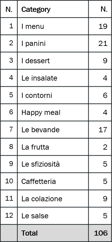
In the section, there are 106 products organized in 12 categories.
PROBLEMS
- There are no options that allow the user to search or to filter the products.
- Despite the proposed cards layout redesign could improve the way by which users navigate in the section, a dedicated search tool should be implemented.
- To retrieve the allergens information, the user’s needs to consult each product page.
#5b. PRODUCTS SEARCH BOX (new feature)
SOLUTION
- With the aim to help the users in finding the products and retrieve the related information, a search tool for the products section is proposed.
- By clicking on the search icon it is triggered the transition that transforms the top bar in a search box.
- When two or more characters are typed in the search field, the system provides suggested terms to ‘autocomplete’.
- The selection of one of the proposed words triggers the system search that provides the results organized by categories.
- The selected word is automatically filled in the search field.
- By clicking on the ‘x’ icon the search results are deleted and the default page is restored with a fade transition.
#5b. PRODUCTS ALLERGENS FILTER (new feature)
SOLUTION
- With the aim to help users affected by food allergies to find products with adequate ingredients, a filter for food allergens in the category page is proposed.
- The decision to not have the filter in the main categories page is made to prevent an overflow of information for the user.
- By clicking on the filter icon it is triggered the transition that transforms the top bar in a filter box with all the allergens listed.
- By clicking on an allergen, the system removes all the products that contain that ingredient.
- The feedback is provided by the transition on the products list and by the transformation of the icon related to the allergen selected.
- By clicking on the ‘x’ icon, the filtered results are deleted and the default page is restored with a fade transition.
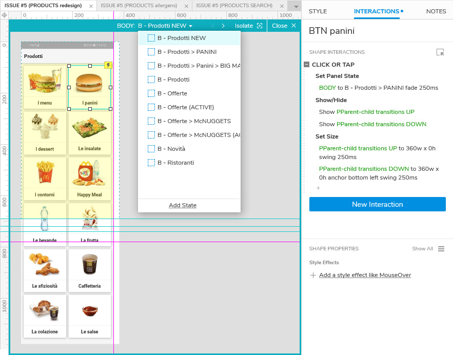
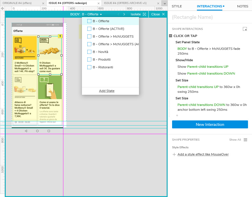
AXURE RP WORKSPACE
The prototype has been developed with Axure RP. The first workspace refers to issue #4 (Offers) and the second to issue #5 (Products). The images show the structure of the prototype and the panel with the selected element interactions.
Axure RP workspace – Issue #4 (Offers)
Axure RP workspace – Issue #5 (Products)