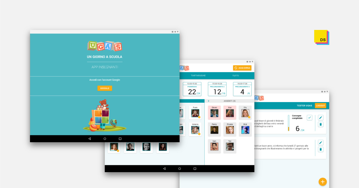
UGAS TEACHERS’ APP
Context
- Master’s Degree in HCI,
Internship and Master Thesis project - Individual project
IN A NUTSHELL
With the aim to improve the user experience of the UGAS teachers’ app, starting from an in-depth analysis of the current version of the app, I create a redesigned app prototype and then I evaluated it with the users with usability testing, interviews, and thematic analysis.
IN DETAIL
THE UGAS APPS
Improving daily communication between teachers and parents

The UGAS – Un Giorno A Scuola (i.e. A Day At School) system, developed by FBK − Fondazione Bruno Kessler, aims to improve daily communication between teachers and parents of children enrolled in Italian kindergartens. The mobile apps, one for parents and one for teachers, allow sharing information to simplify and make more efficient the management of the daily presence and the activities of children at school.
Starting from 2016 with one kindergarten, in the school year 2019-2020 the UGAS system has been implemented in 15 kindergartens in the province of Trento.
THE PROJECT
The project started with the internship that I held at Fondazione Bruno Kessler, as a part of the curriculum of the Masters’ degree in Human-Computer Interaction (HCI) of the University of Trento. The goal of the project was to create a new design concept of the UGAS mobile apps (parents and teachers) and then to validate the two interactive prototypes with the users. The activities carried out could be divided into three phases: “analysis”, “design”, and “evaluation”. The methods and the contribution to the topic of the study have to be placed in the framework of qualitative research in Human-Computer Interaction (HCI) and User experience (UX).
THE PROCESS
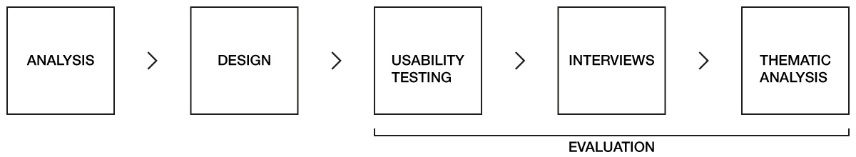
Analysis
The “analysis” phase started with the study of both informative materials and an already existing analysis of the components of the UGAS system. At the same time, I had the opportunity to access to a test environment that allows to try and to test the components of the UGAS system. As a result, I had a clear picture of the different components of the system, their relationship and how they work.
the analysis of the current version of the mobile app was carried out with the aims to:
- underlining interface problems
- providing redesign proposals to improve the apps
- summarizing the key information to be used in the design process.
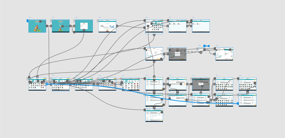
ANALYSIS AND DESIGN
The teachers’ app analysis refers to the app version 3.0.3 and it was carried out before the definition of the design constraints. For each section are reported the information related to navigation, interaction, and the estimated effort to implement the redesign proposals in the three different dimensions (layout, interaction and navigation) considering both design and development. According to the main functionalities, the app can be divided into 6 sections:
- Access
- Home
- Drawer menu and navigation
- Child’s profile and Chat
- Communications management
- Alerts.
Here are reported, as examples, the analysis and the design solutions proposed in the prototype for the sections “Home” and “Communications management“.
Interfaces in the box with the label 3.0.3 refer to the original version of the app, while interfaces in the box with my logo refer to the redesigned version.
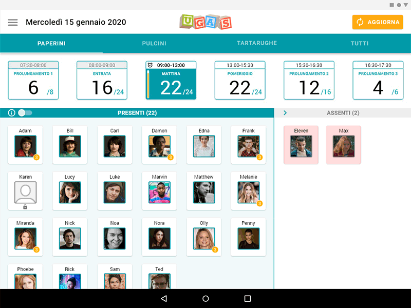
Home analysis (version 3.0.3)
The homepage works as a dashboard and its main function is to display information relating to the presence of children in relation to groups and time slots of the day. The home needs a redesign that comprises all the elements of the interface (layout, aesthetics, and interaction) to improve and clarifying the information presented. For example, Andrea’s card seems disabled, while the different opacity means that Andrea is absent and by tapping on his card it is possible to access the child’s profile. The introduction of additional information and allow teachers to manage the information displayed should be considered in the redesign.
Navigation
After the splash screen visualization or login (if it is, for example, the first access)
Interaction
Consult the dashboard, access children’s profiles and drawer menu
Estimated effort
High
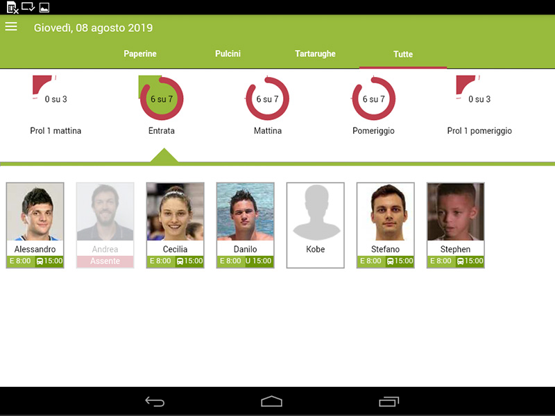
The header now clearly differentiates between the top bar and the tabs navigation bar. The area dedicated to the navigation between time slots is updated through a card system. Each card presents the following information: time slot (e.g. “09:00-13:00”), time slot name (e.g. “morning”), number of children present, number of children expected and a vertical graph bar that visually shows the proportion between children present and children expected. The number of children present is emphasized as it is a primary information for teachers. The selected “time slot card” is highlighted with the blue background. The current time, in which the teacher is consulting the dashboard, is highlighted with the “clock” icon and the time slot text emphasized in bold. When a time slot is terminated, only the area of the card dedicated to the time slot is disabled, as it is still possible to consult the children present at that time.
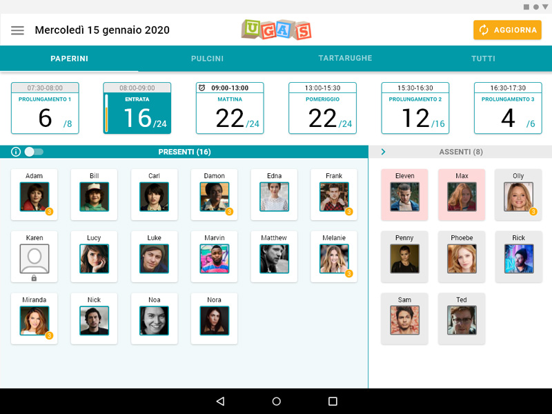
The area related to the children cards is now divided into present and absent, with more space dedicated to the cards of the children present. Into the two areas, the cards are sorted by alphabetical order. The child’s card shows by default the child’s name, the profile picture, and the badge notification related to unread messages.
Two options are introduced to allow teachers to personalize the dashboard in relation to the children profile cards. First, the toggle button allows switching from the default visualization to a card with three additional information: time of entry, time of exit, and the name of the person who will take the child out of school. Second, the “arrow” icon allows to further minimize the absent column to mainly focus on the present children.
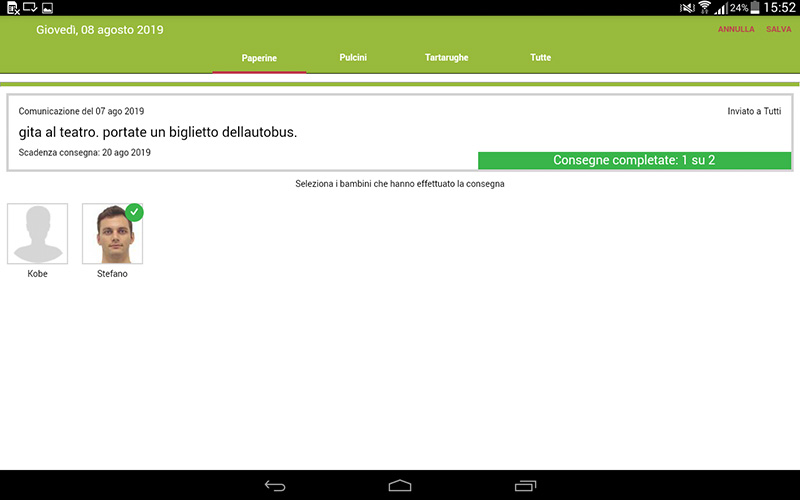
Communications management analysis (version 3.0.3) [1/2]
The use of the horizontal space of the tablet in “communications management” is not optimal. Both in the “communications list” and in the creation of a “new communication”, a redesign that comprises all the elements of the interface is needed. The information related to the authenticated teacher and the “logout” button could be moved from the bottom to the top of the interface. The introduction of a system that allows teachers to known when parents have read the communications would be a valuable improvement in the use of the functionality.
Navigation
From the drawer menu
Interaction
Create, modify, delete, check communications
Estimated effort
High
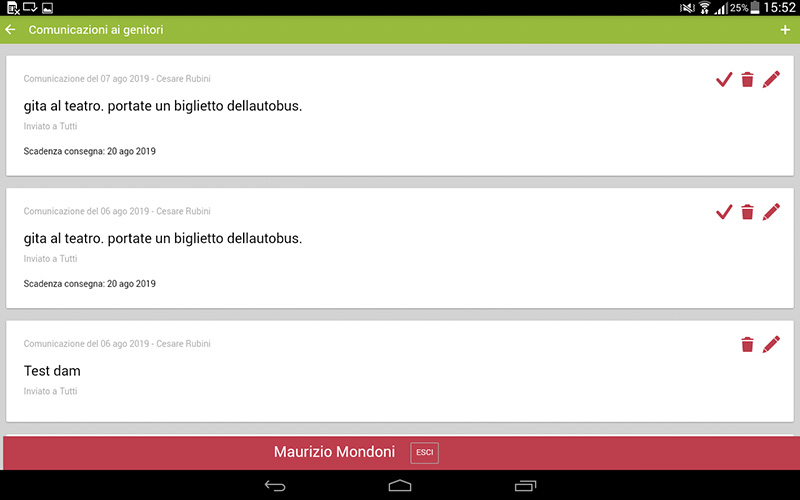
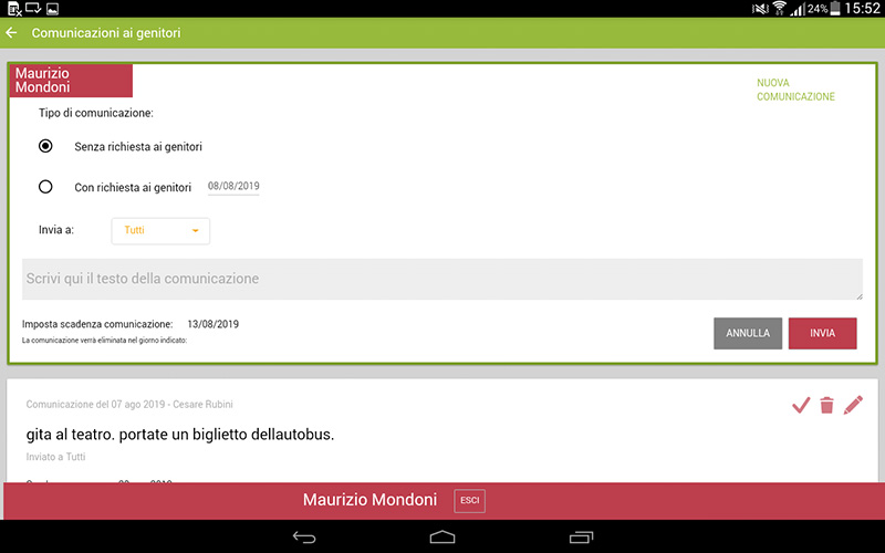
Communications management analysis (version 3.0.3) [2/2]
No feedforward is provided in relation to the action of updating the child assignment status of “communication with assignment” by tapping on the card. The interface strongly recalls the layout of the home, but the navigation is limited to the actions “Cancel” and “Save”. The redesign of this page should follow the changes that will be introduced in the homepage and the other pages of the section to maintain consistency in the different part of the app.
Navigation
From the “check (✓)” icon in the communication card
Interaction
Flagging children’s cards of the children and change visualization by groups
Estimated effort
High
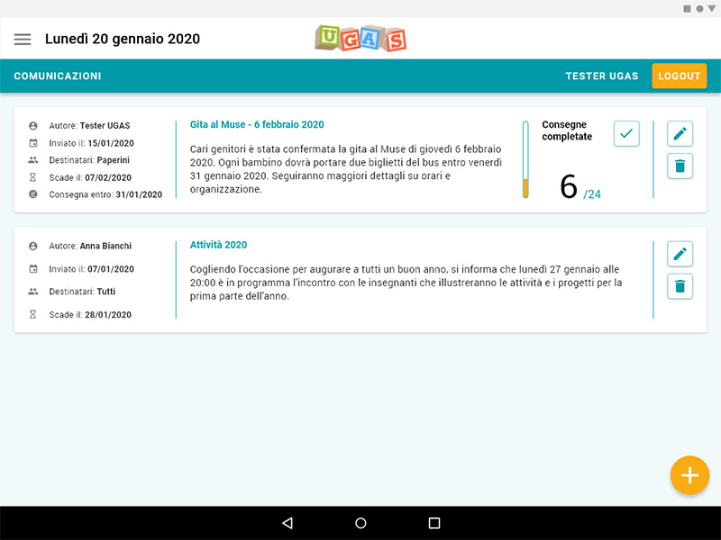
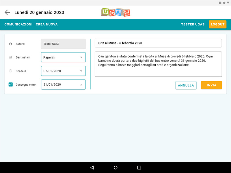
Communications management redesign [1/2]
The optimized use of the horizontal space allows providing more information. The communication box is now organized in three columns. On the left, there is all the information related to the communication. In the centre, there are the title and the full text of the communication. On the right, there are the buttons to manage the communication. The primary action to create a new communication is now associated with the FAB button. The bar with the information related to the authenticated teacher and the “logout” button is positioned on the top.
The “new communication” is now included in a dedicated page, in which the box follows the structure of the box in the communications list, with the forms to be edited on the left column. The “author” form is not modifiable as the teacher’s name is directly related to the PIN authentication system.
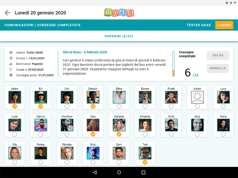
Communications management redesign [2/2]
The page that allows teachers to check and to update the status of “communication with assignment” is updated according to the other pages of the section.
The children’s cards follow the style of the home with the child’s name and the profile picture. Through the outlined circle, affordance is provided in relation to the action of updating the child assignment status by tapping on the card. The “arrow” icon element is introduced to allow to navigate back. The numbers and the progress bar update according to the number of cards selected.
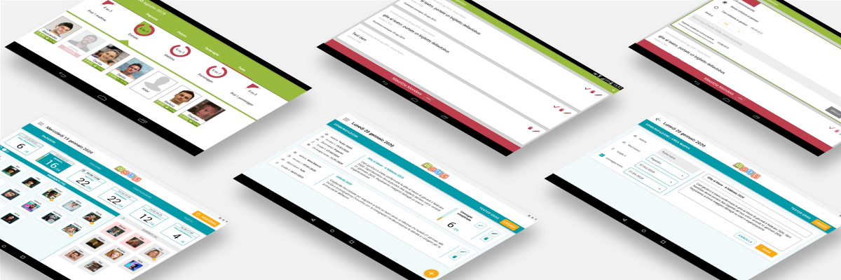
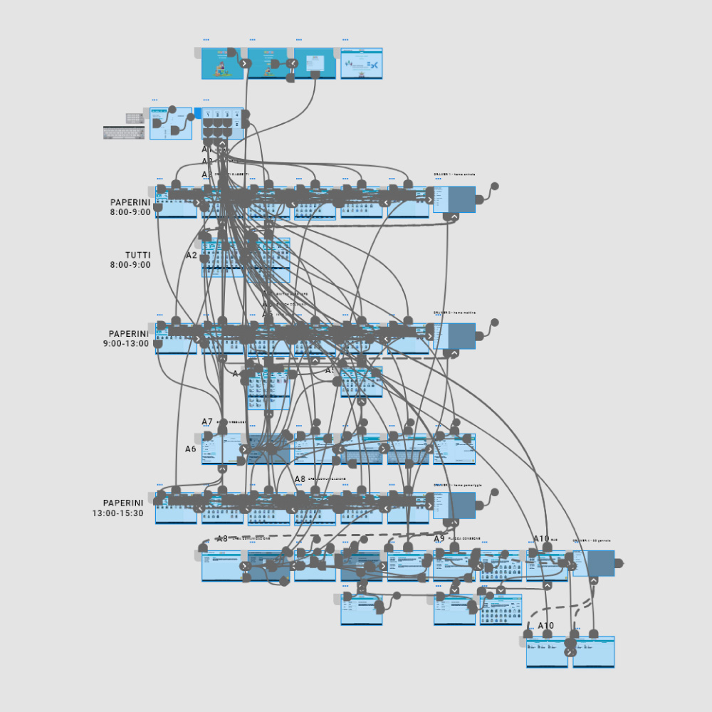
ADOBE XD WORKSPACE
The prototype has been developed with Adobe XD. The first workspace refers to a version of the prototype (November 2019) presented by me in one of the meetings with the project manager. The second workspace, in “prototype view”, refers to the updated prototype (January 2020) according to the descriptions of the tasks for the usability tests, to allow the participants to properly interact in the different areas of the mobile app during the test. The image shows the increased complexity of the interactive prototype for the usability test in comparison to the previous version.
Adobe XD workspace (November 2019)
Adobe XD workspace for “Usability tests” (January 2020)
EVALUATION – USABILITY TESTING
Tests
The evaluation of the redesigned prototype was conducted through the administration of usability tests with representative users attempting representative tasks. At the end of each test, an unstructured interview based on the dimensions of the User Experience Questionnaire (UEQ) was conducted.
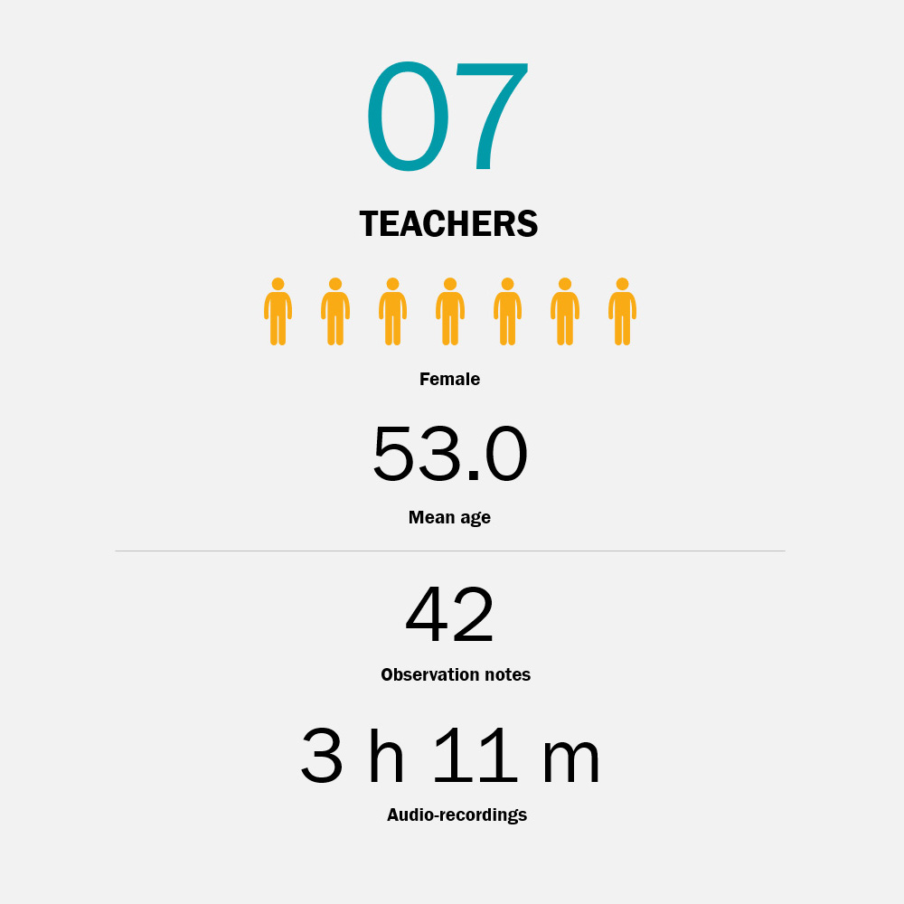
Tests, divided into three sessions, were administered to 7 teachers, in which two types of data were collected: (1) observation notes on users’ performance and usability issues and (2) audio-recordings of users’ “think aloud” and interviews.
The notes related to each task have been analysed with reference to users’ behavioural patterns and emerged issues.
The audio recordings were transcribed, and then thematic analysis was conducted to understand thoughts and feelings about the user experience with the UGAS mobile app in the context of family-school partnership and communication.
Tasks
Ten tasks have been developed for the teachers’ app tests. Considering that the interface of the mobile app is influenced by the time in which the user is interacting with the app (e.g. the highlighted time slot), information of date and time were provided to set the context for each task. Thus, the progressive number of tasks follows the progress of time in the proposed scenario.
Each task refers to one or more goals with reference to the key areas of the prototypes to be investigated. Each task was presented to participants, in progressive order, on a dedicated printed card (210 x 150 mm) with the following information: (1) the title, (2) the context information (e.g. “Time: 7:30 a.m.”) and, when needed, additional information to perform the task (e.g. “Google account” or “PIN”), and (3) the description of the task with the keywords highlighted in bold.
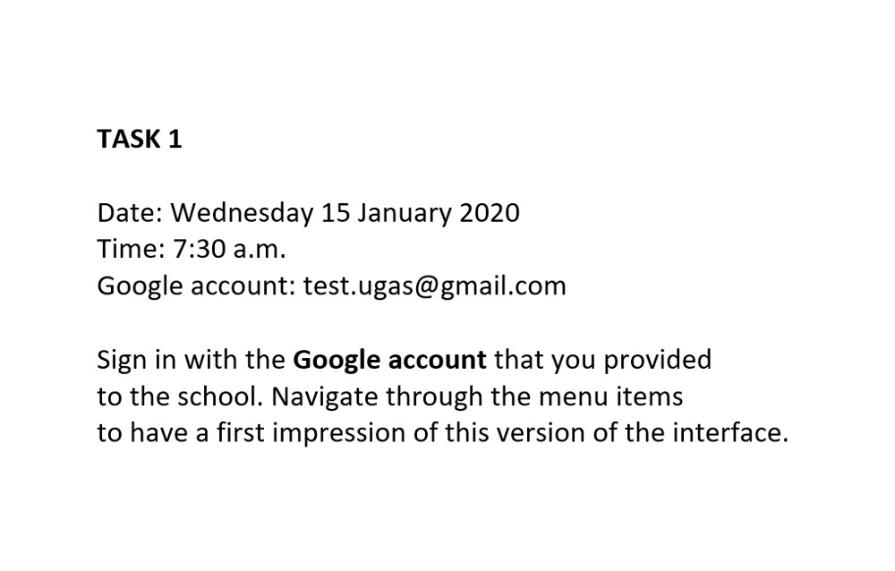
Usability task success rate
The task success rate refers to “the percentage of tasks that users complete correctly” as defined by Nielsen and for each task goal. Each task completed in which the moderator intervened by providing information or suggesting actions was recorded as (P) “partial success”. Sometimes the user was stuck even after the intervention of the moderator and it was decided in these cases to record the task as (F) “failure” rather than forcing the user to complete the task.
In the table is possible to see how the intervention of the moderator was mainly needed in the tasks related to “dashboard” (T3, T4, and T5) and in the task related to “communications” (T8).
In relation to the “dashboard”, two considerations are needed. First, in the dashboard are present numerous elements (e.g. groups, times slots, and children cards) and related information. Second, the redesigned dashboard and how information is presented should be considered as a novelty for teachers. Therefore, it is likely that by using the app regularly they would become familiar with the new dashboard and related information.
Lessons learned for design
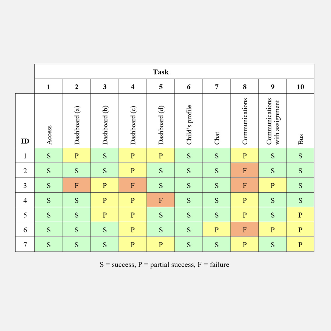
During the observation of the teachers performing the usability tests emerged behavioural patterns and usability issues. For each usability issue, comments and design insights have been provided and the following summary should be used to improve the redesigned teachers’ app:
- evaluate the central role in the interface of the navigation between time slots and related information (e.g. number of present children) in relation to the effective use of the app by teachers [see image below – box A];
- consider reducing the information provided in the left column of each card in the communications list [box B];
- improve the visibility of the links related to the “check” of a “communication with assignment” with the introduction of a dedicated button with icon and label [box C].
- improve the visibility of the FAB button with the extended version (with label) for the creation of a “new communication” [box D];
- investigate the creation of a “new communication” by focusing the usability task only on the last step of the process.
EVALUATION – THEMATIC ANALYSIS
Understanding users’ thoughts and feelings
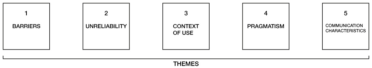
From the thematic analysis, 5 themes emerged: (1) “barriers”, (2) “unreliability”, (3) “context of use”, (4) “pragmatism”, and (5) “communication characteristics”. The five themes emerged help understanding thoughts and feelings of parents and teachers about their experience with the mobile apps and the UGAS system. The different facets of the themes provide insights that could be used, from the design process to the management of the project, to improve the UGAS system.
1. Barriers
The first theme relates to the barriers that limit the use of the mobile apps and consequently the effectiveness of the UGAS system. Concrete barriers refer to habits that both parents and teachers seem reluctant to change. Perceived barriers refer to supposed skills limitations related to the age of users and foreign parents.
2. Unreliability
The second theme refers to the unreliability of the UGAS system. The unreliability of the system is underlined by teachers and it seems to be relevant as it directly affects their work. The issue seems to be related to two factors, the timing of activation of the UGAS service and a lack of commitment and involvement of parents.
3. Context of use
The third theme refers to how the context of use affects the use of the mobile apps. The context of use clearly relates to the difference between the two groups, for parents the issue primarily refers to the “family schedule” while for teachers the issue primarily refers to the “kindergarten environment”. Starting from the theme, it is possible to summarize the characteristics of each context of use.
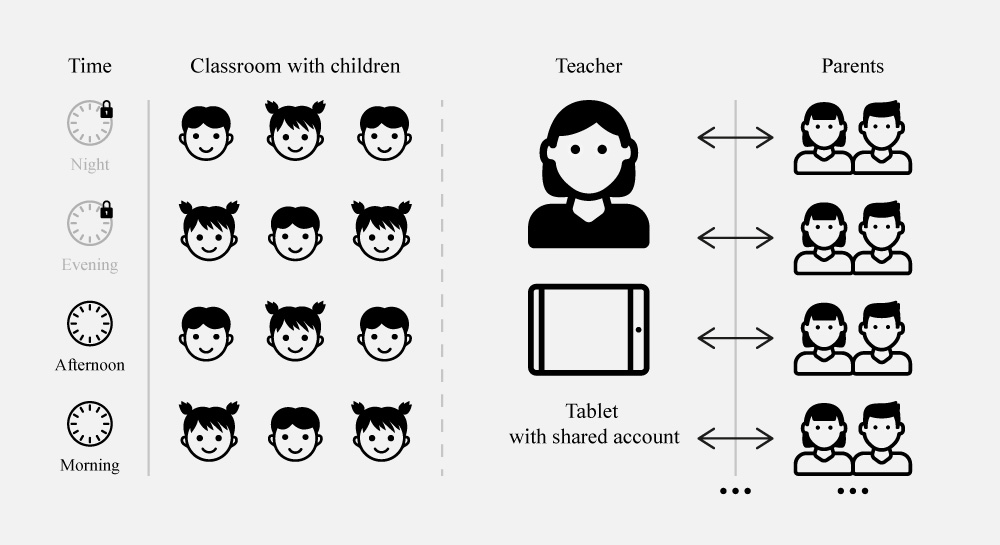
TEACHERS
Teachers have time (e.g. “morning” or “afternoon”) and place (the “classroom”) constraints to use the app, at the same time they should take care of children, they use an app developed for tablet with a shared account, and they refer to multiple entities (“parents”).
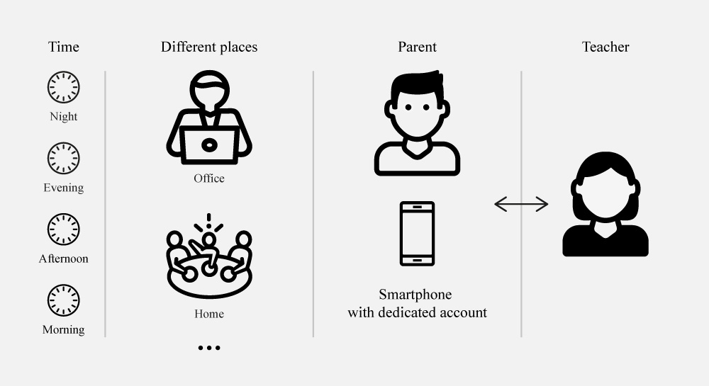
PARENTS
Parents have no time (e.g. “morning” or “night”) or place (e.g. “office” or “home”) constraints to use the app, they use an app developed for smartphone with a dedicated account, and they refer and communicate to a single entity (an undefined “teacher” before to start the conversation).
4. Pragmatism
The fourth theme refers to the theoretical framework of the User Experience Questionnaire (UEQ). It clearly emerged that both parents and teachers are largely focused on the dimension of “pragmatic quality” of the system rather than on the dimensions of “hedonic quality” or “attractiveness”.
5. Communication characteristics
The fifth theme refers to the theoretical framework of family-school partnership and communication. It emerged that the characteristics of the communication, (“synchronous” and “asynchronous”), are perceived as very supportive characteristics of the apps. It emerged how “individual communication” is perceived positively and how it fosters “communicating”.
Recommendations
Starting from the insights of each theme, comments, proposals, and recommendations have been provided, and the following summary should be used to improve the UGAS system:
- consider the different users’ needs and constraints in relation to the two different contexts of use as a reference for the design process and future implementations of the UGAS mobile apps;
- consider the concepts related to “pragmatic quality” (“efficiency”, “perspicuity”, and “dependability”) as a reference for the design process and, accordingly, consider for future versions to simplify and improve the interaction patterns.
- organization of training meetings and creation of informative materials, for parents and teachers, related to (1) the characteristics and functionalities of the mobile apps, and (2) the importance of family-school partnership and parent involvement for children, and the central role of communication and the role of technology to foster this partnership;
- ensure the availability of the UGAS service from the begin of the school year;
- ensure the stability of the UGAS system from a technical point of view.
CONCLUSIONS
The redesigned interactive prototype has been designed, tested, and evaluated with the users. The redesigned app could be developed and implemented in the UGAS system.
Additionally, a summary of the lessons learned for design and recommendations for design and project management has been provided.
Hopefully, the improved UX of the app could enhance the communication between parents and teachers, and foster parent involvement.
The UGAS system is composed of two mobile apps, one for parents and one for teachers. This page presents one part of the story. See the dedicated page for the details related to the UGAS PARENTS’ APP.